
Sunday, December 10, 2006
NotBeige
All of the sudden there has been a flurry of activity at Casa Splatgirl. Mostly stuff that was postponed pre-move in and should have gotten done months ago. But hey, I think we're well on track for having everything done before the turn of the decade, so no worries, right?
Anyway, one of the ongoing agonies you may recall me sharing with you before has been what color to paint the other, giant living-media-balcobrary-seen-from-everywhere-in-the-house wall. In case you forgot, giant wall #1 got Chartreuse, which I absolutely ADORE, but it's a bit much for an entire nuther huge expanse.
Does it seem like we have been here before? Probably because we have. My original color choice for wall #2 ended up sucking. It was much too blah, and because I don't have enough to paint already without having to repaint things, there was no way I could pick the perfect color on my first try anyway. But I guess the good part of that is that I didn't paint the whole wall, rather just the easy-to-reach part in the media room so I'm not feeling terrible about having to have a little bit of do over.
Anyway, here is my test swatch. I think I'm 90% sure this is the IT color, but, like the Chartreuse, it's a little spooky when I consider that there will be approximately an acre of it:
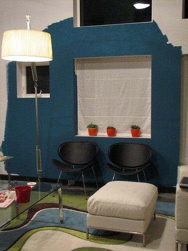
This is a deeper version of the lovely Rendezvous Bay that's already in the kitchen, called Naples Blue. Both are by Benjamin Moore.
And, in case you're wondering...yes, I am that person who paints their walls those crazy colors you see on the paint chips and wonder "WHO would possibly ever choose THAT color?" I am also that person who gets all itchy and irritated in those beige-cum-pottery barn houses.
Someday, when I am through with this, breathing a sigh of relief and thinking about what to change, I'll do a composite of of all the colors I have used and we will laugh, cry, gasp, or all of the above.
Anyway, one of the ongoing agonies you may recall me sharing with you before has been what color to paint the other, giant living-media-balcobrary-seen-from-everywhere-in-the-house wall. In case you forgot, giant wall #1 got Chartreuse, which I absolutely ADORE, but it's a bit much for an entire nuther huge expanse.
Does it seem like we have been here before? Probably because we have. My original color choice for wall #2 ended up sucking. It was much too blah, and because I don't have enough to paint already without having to repaint things, there was no way I could pick the perfect color on my first try anyway. But I guess the good part of that is that I didn't paint the whole wall, rather just the easy-to-reach part in the media room so I'm not feeling terrible about having to have a little bit of do over.
Anyway, here is my test swatch. I think I'm 90% sure this is the IT color, but, like the Chartreuse, it's a little spooky when I consider that there will be approximately an acre of it:
This is a deeper version of the lovely Rendezvous Bay that's already in the kitchen, called Naples Blue. Both are by Benjamin Moore.
And, in case you're wondering...yes, I am that person who paints their walls those crazy colors you see on the paint chips and wonder "WHO would possibly ever choose THAT color?" I am also that person who gets all itchy and irritated in those beige-cum-pottery barn houses.
Someday, when I am through with this, breathing a sigh of relief and thinking about what to change, I'll do a composite of of all the colors I have used and we will laugh, cry, gasp, or all of the above.
Comments:
<< Home


I think it looks like a VERY restful color. I vote aye (that is, if we get a vote here in the innernets)
Post a Comment
<< Home
![]()